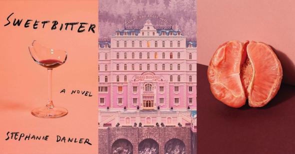
In an article in Glamour Magazine, “Millennial Pink” is described as “a pink with the blue taken out…or blush with a beige tint.”
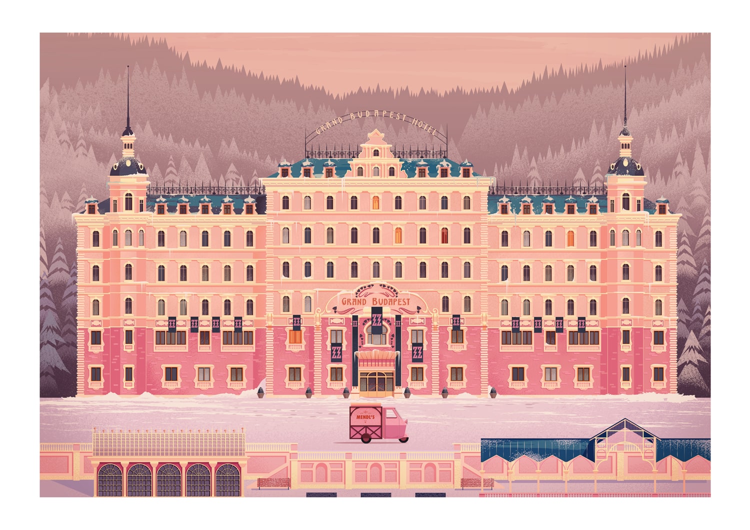
The Guardian sites it’s origins with the 2014 Wes Anderson Movie The Grand Budapest Hotel. “It embodies a kind of arch retro-kitsch and is centered on a building painted several kinds of pink.”
The Next year in 2015, Apple came out with the “rose gold” iPhone, sparking a color trend that caught the attention of Pantone (the general “color authority” for yearly color trends), pushing them to name Rose Quartz as their colour of the year.
Fast forward a few years, and in 2017 Pantone named “Pale Dogwood” as the color of 2017 in their spring fashion report. This pink is described as “a quiet and peaceful pink shade that engenders an aura of innocence and purity”.

Diving into the Psychology behind color can lead us down a rabbit hole, but for this particular soft shade of pink, part of the draw has to do with current ideas of gender roles, beauty, evolution and science.
In Bustle, JR Thrope explains that “there doesn’t seem to be any innate, evolutionary propensity for women to like pink more than men…” but really the pink-based bias runs deep based on cultural norms and ideals.
“The most famous color study based on the human reaction to pink focuses on a color that’s quite similar to millennial pink: a shade called Baker-Miller Pink. The color was created by the biosocial researcher Alexander Schauss in the late 1970s by mixing red and white paint, and tested at naval facilities to see if it calmed down prisoners in cells painted with its delicate hue. Schauss’s experiments showed that it lowered blood pressure and aggressive behavior, as did other experiments in the 1980s….” However, current researches think the data is old, and doesn’t portray significant effects on human behavior.

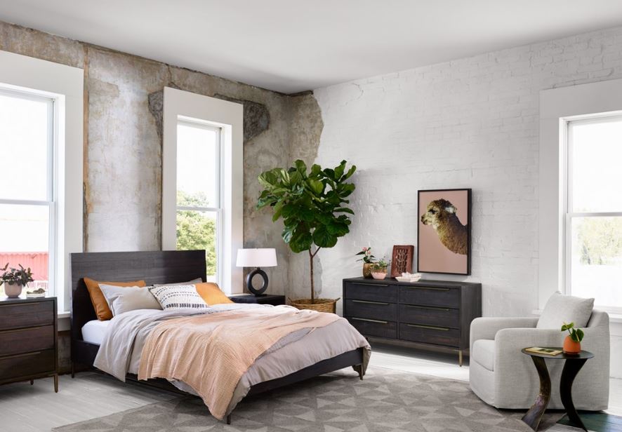
Last month at the winter furniture market, we were inundated with pops of this soft “blush” shade in almost every showroom. So much so, that we started taking pictures of it everywhere we went. (It didn’t help my case that I was WEARING the color that day).
It’s being used in textiles, accessories, artwork and plantlife accents. It can be used subtlety with a single accent piece or serve as the main motif throughout the space.
Like all trends in life, they come and go… But for now, I’m LOVING “millennial pink” and will use it (sparingly) with any design that lets me.
Best,