Subway Tile. Some people love it, and some people don’t.
But if you’re one of those that thinks this classic tile is a little “tired” and over used, then this post is for you.
Below we’ve compiled our favorite alternatives to the original 3-by-six tile, that will still give your design a clean and simple feel. Whether you simply change the size, or maybe the color of the simple porcelain tile, there’s just as many variations as there are hours in a day, or better yet rooms in your house.
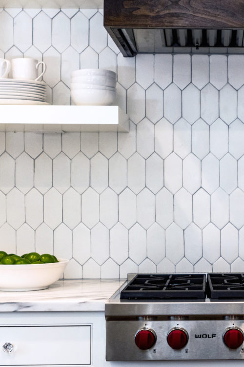
This shape is quickly becoming a new favorite in kitchen and bath trends. The updated shape adds a little interest without being too overwhelming.
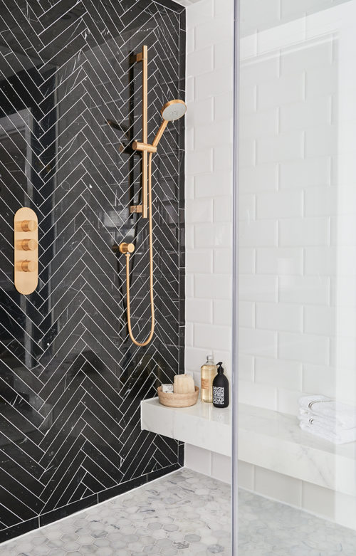
By simply making the tile wider, and re-imagining the classic white into a taupe-y grey, this kitchen feels like it’s completely stepped away from the original porcelain tile. To step it up a notch, try installing the tile in a unique pattern. Such as herringbone shown above.
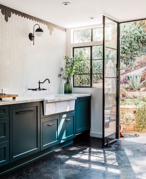
Similar to the herringbone shown above, this classic pattern can be expressed in many different ways. The white mosaic creates a simple backdrop of white, while adding a ton of interest with the minuscule pattern in such a large space.
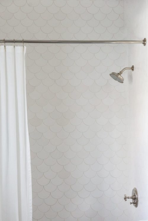
Once again, changing the shape from a generic rectangle adds interest without being overwhelming. We love the use of scallop tile in the bathroom, because it reminds us of the ocean.
Simply by over sizing the subway tile, it feels completely re-imagined. While the color and shape ring true to the classic porcelain tile it has a different, almost playful feeling, being over sized.


